What is a Landing Page? The Ultimate Guide for 2025
In today's hyper-competitive digital landscape, businesses invest heavily in driving traffic to their websites through paid advertising, social media campaigns, email marketing, and content strategies. However, traffic alone doesn't guarantee success. What happens after a visitor clicks on your ad or link is equally—if not more—important than getting them to click in the first place. This is where landing pages become the linchpin of your digital marketing success.
Landing pages are specialized web pages designed with a singular mission: to convert visitors into leads or customers. Unlike general website pages that serve multiple purposes and offer various navigation paths, landing pages focus the visitor's attention on one specific action, eliminating distractions and guiding them toward conversion.
Throughout this comprehensive guide, we will explore every aspect of landing pages—from their fundamental definition to advanced optimization techniques. Whether you're a marketing professional looking to sharpen your skills, a business owner seeking to improve your online presence, or a designer wanting to create more effective pages, this guide will provide you with the knowledge and insights needed to master the art and science of landing page creation.
By the end of this article, you'll understand not just what landing pages are, but why they're essential for modern digital marketing, how to design them for maximum impact, and the proven strategies that separate high-performing landing pages from those that fail to convert. Let's dive deep into the world of landing pages and unlock their potential for your business.
What Exactly is a Landing Page?
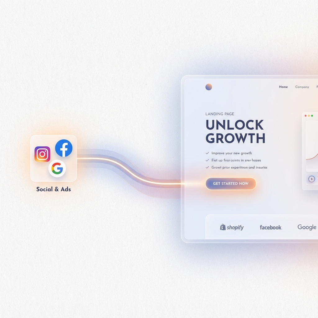
A landing page is a standalone web page created specifically for a marketing or advertising campaign. It's the page where a visitor "lands" after clicking on a link in an email, advertisement, social media post, or search engine result. Unlike typical web pages, which often encourage exploration and provide multiple paths for visitors to follow, landing pages are designed with a single, focused objective known as a Call to Action (CTA).
The primary purpose of a landing page is to convert visitors—turning anonymous traffic into identifiable leads or paying customers. This conversion could mean different things depending on your business goals: submitting a contact form, signing up for a newsletter, downloading an ebook, registering for a webinar, starting a free trial, or completing a purchase.
The Anatomy of Purpose-Driven Design
What makes landing pages so powerful is their intentional simplicity. Every element on a landing page—from the headline to the images, from the copy to the form fields—is carefully crafted to support the primary conversion goal. There are no competing navigation menus pulling visitors away, no sidebar content to distract them, and no unrelated links that might derail the conversion process.
Think of a landing page as a digital salesperson with extreme focus. While a regular website page is like a general store where customers can browse various departments, a landing page is like a dedicated product specialist who guides each visitor toward a specific outcome with laser-like precision.
The Psychology Behind Landing Pages
Landing pages work because they leverage fundamental principles of human psychology. When presented with too many choices, people often experience decision paralysis—a phenomenon well-documented in psychological research. By presenting a single, clear option, landing pages eliminate this paralysis and make it easier for visitors to take action.
Furthermore, landing pages create what marketers call "message match"—the alignment between the promise made in an advertisement and the content delivered on the destination page. This consistency builds trust and reassures visitors that they've arrived at the right place, significantly increasing the likelihood of conversion.
Landing Pages in the Marketing Funnel
Understanding where landing pages fit within your overall marketing funnel is crucial for using them effectively. Landing pages typically serve as the gateway between awareness and consideration, or between consideration and decision. They're the critical junction where casual interest transforms into meaningful engagement.
At the top of the funnel, landing pages might offer educational content like ebooks or guides in exchange for contact information. In the middle of the funnel, they might promote webinars, case studies, or product demonstrations. At the bottom of the funnel, landing pages become the final step before a purchase or sign-up, addressing last-minute objections and providing the compelling reasons needed to close the deal.
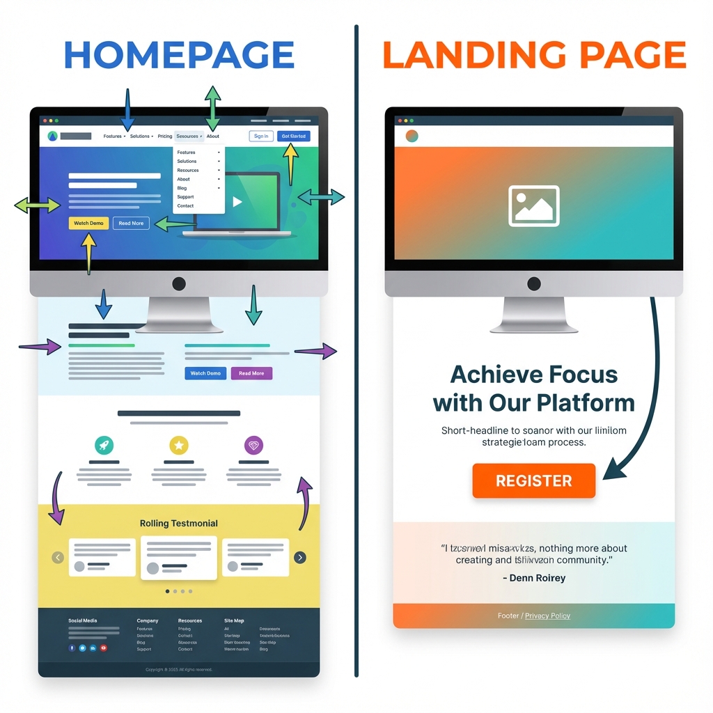
Landing Page vs. Homepage: Understanding the Key Differences
One of the most common misconceptions in digital marketing is confusing landing pages with homepages. While both are important components of your web presence, they serve fundamentally different purposes and are designed with different objectives in mind. Understanding these differences is essential for leveraging each effectively.
Purpose and Focus
Your homepage serves as the front door to your entire website. It introduces visitors to your brand, showcases the breadth of your offerings, and provides navigation paths to various sections of your site. A homepage must cater to multiple visitor types—potential customers, existing customers, job seekers, investors, media contacts, and more—each with different needs and interests.
A landing page, in contrast, is built for a single campaign with a single goal. It speaks to a specific audience segment about a specific offer, using targeted messaging that resonates with that particular group. This focused approach allows for much tighter alignment between visitor expectations and page content.
Navigation and User Journey
Homepages typically feature full navigation menus, footer links, and multiple pathways for exploration. This makes sense because homepage visitors often arrive without a specific intent—they're exploring, learning, and deciding whether your brand is worth further investigation.
Landing pages intentionally limit navigation options. Many landing pages remove the main navigation entirely, presenting only the content needed to convert. This might seem restrictive, but it's actually liberating for visitors who have already expressed interest (by clicking an ad, for example) and simply need to complete their journey without unnecessary detours.
Design Philosophy
Homepage design prioritizes brand storytelling and comprehensive information architecture. It needs to make a strong first impression while also serving as an organizational hub for all your web content. Visual hierarchy on a homepage must balance multiple competing elements and messages.
Landing page design follows what might be called the "single conversation" principle. Every visual element, every word of copy, every image and icon supports the same narrative thread, building toward the inevitable conclusion: taking action on the CTA. This design philosophy creates a more persuasive and compelling user experience.
Metrics and Success Criteria
Homepage success is typically measured through metrics like bounce rate, time on site, pages per session, and overall engagement. These metrics reflect how well the homepage introduces visitors to your brand and encourages exploration.
Landing page success is almost exclusively measured by conversion rate—the percentage of visitors who complete the desired action. This singular focus on conversion makes landing pages highly measurable and optimizable through techniques like A/B testing.
When to Use Each
- Use your homepage when you want to:
- Build brand awareness and establish credibility
- Provide a comprehensive overview of your company
- Serve diverse visitor segments with varying intents
- Create a central navigation hub for your entire web presence
- Use landing pages when you want to:
- Drive conversions for a specific campaign
- Capture leads for a targeted offer
- Test messaging for a specific audience segment
- Maximize ROI on paid advertising spend
Types of Landing Pages: Choosing the Right Format for Your Goals
Not all landing pages are created equal. Different marketing objectives require different landing page approaches. Understanding the various types of landing pages and their appropriate use cases will help you select the right format for each campaign.
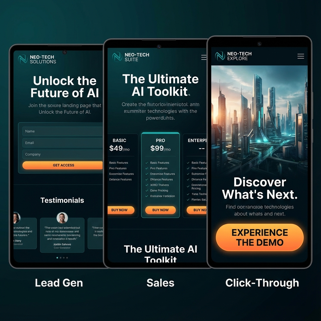
Lead Generation Landing Pages (Lead Capture Pages)
Lead generation pages, sometimes called "squeeze pages," are designed to collect contact information from visitors in exchange for something of value. This value exchange—offering content, tools, or access in return for personal details—forms the foundation of modern inbound marketing.
- Common offers on lead generation pages include:
- Ebooks and whitepapers
- Industry reports and research
- Webinar registrations
- Newsletter subscriptions
- Free tools or calculators
- Templates and checklists
- Course enrollments
- Free consultations
The key to successful lead generation pages is ensuring that the perceived value of your offer exceeds the perceived cost of providing personal information. Modern internet users are increasingly protective of their data, so your offer must be genuinely compelling.
Lead generation pages typically feature longer forms that collect more detailed information, as the leads gathered will enter a nurturing sequence designed to move them through the marketing funnel over time.
Click-Through Landing Pages
Click-through pages serve as a warming-up stage before the actual conversion. Instead of trying to capture information directly, they provide detailed information about a product or offer and then direct visitors to another page (usually a shopping cart or registration form) to complete the conversion.
- These pages are particularly valuable for:
- E-commerce products that need explanation
- SaaS free trial sign-ups
- Complex services that require education
- High-consideration purchases
Click-through pages work by addressing objections, building desire, and establishing trust before visitors encounter the commitment of entering payment information or completing a lengthy registration.
Sales Landing Pages (Product Pages)
Sales landing pages are designed to directly sell a product or service. They combine persuasive copywriting, compelling visuals, social proof, and clear pricing to move visitors from interest to purchase. These pages often employ long-form content, as high-ticket items typically require more persuasion.
- Effective sales landing pages include:
- Detailed product descriptions and features
- Benefits-focused copywriting
- Customer testimonials and reviews
- Comparison with alternatives
- Money-back guarantees and trust signals
- Clear pricing and purchasing options
- FAQ sections addressing common objections
Splash Pages
Splash pages are introductory pages that visitors see before accessing the main content of a website. Unlike other landing page types, splash pages don't typically aim for lead capture—instead, they might announce something important, verify age, allow language selection, or set expectations.
- While less common today than in earlier internet eras, splash pages still have legitimate uses:
- Age verification for restricted content
- Geographic or language preference selection
- Major announcement or event promotion
- Special promotion highlighting
Squeeze Pages
Squeeze pages are a specialized, aggressive form of lead generation page. They typically offer extremely minimal content—often just a compelling headline, brief copy, and an opt-in form. The goal is to "squeeze" the visitor's email address with minimal friction.
- These pages work best for:
- Building email lists quickly
- Offering simple, highly desirable lead magnets
- Capturing leads from high-intent traffic sources
Thank You Pages (Confirmation Pages)
- While often overlooked, thank you pages are crucial components of the landing page ecosystem. These pages appear after a visitor completes a conversion and serve multiple purposes:
- Confirming the action was successful
- Providing next steps or delivery information
- Offering additional engagement opportunities
- Making secondary offers or upsells
- Encouraging social sharing
A well-designed thank you page transforms a completed conversion into a deeper relationship opportunity.
Event Landing Pages
Event landing pages are specifically designed to promote and drive registrations for events—whether virtual webinars, in-person conferences, or hybrid gatherings. These pages must convey the value of attending, provide all necessary details (date, time, location, agenda), and make registration as simple as possible.
- Essential elements for event landing pages:
- Compelling event title and description
- Speaker information and credentials
- Agenda or session details
- Date, time, and location (with timezone for virtual events)
- Clear registration form
- Social proof from past events
- Countdown timers for urgency
The Anatomy of a High-Converting Landing Page
Creating a landing page that converts requires understanding the essential components that work together to persuade visitors and guide them toward action. While the specific design and layout may vary, high-converting landing pages share common elements that have been refined through years of testing and optimization.
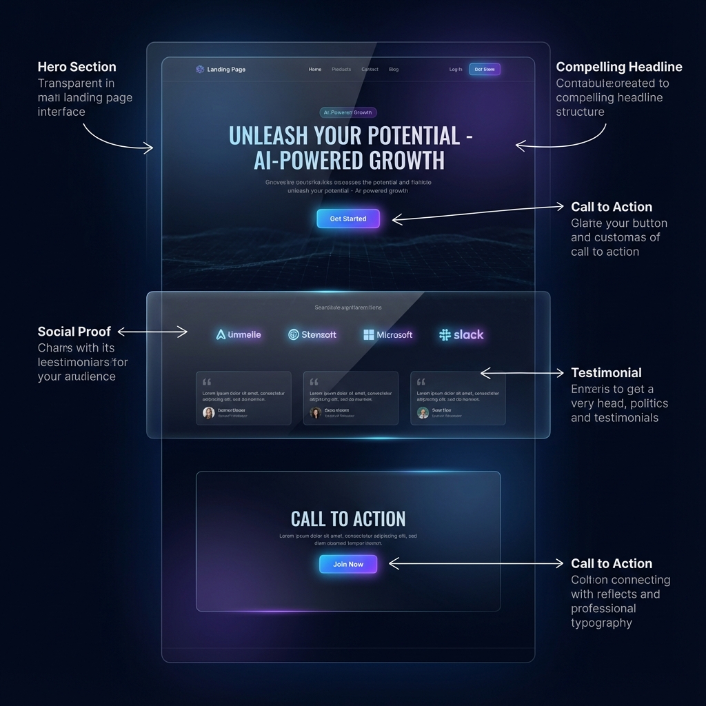
The Headline: Your First and Most Important Impression
Your headline is the most critical element of your landing page. Research suggests that 80% of visitors will read your headline, but only 20% will read the rest of your copy. This means your headline bears enormous responsibility—it must capture attention, communicate value, and compel visitors to continue reading.
- Effective headlines share several characteristics:
- Clarity over cleverness: Your headline should immediately communicate what you're offering. While puns and wordplay might seem creative, clarity wins every time.
- Benefit-focused: Rather than describing what your product is, focus on what it does for the visitor. Lead with the transformation or outcome they'll experience.
- Specificity: Vague headlines fail to resonate. Specific claims ("Increase your conversion rate by 47%") are more compelling than generic ones ("Get better results").
- Urgency or curiosity: The best headlines create a reason to act now or spark enough curiosity to demand further exploration.
Supporting Subheadlines
Subheadlines work in tandem with your main headline to provide additional context, expand on the promise, or add a secondary compelling point. While the headline captures attention, the subheadline often provides the reasoning that keeps visitors engaged.
Compelling Hero Section
The hero section—the area visible without scrolling—must work hard to hook visitors immediately. This section typically includes your headline, subheadline, a brief value proposition, and either an embedded form or a prominent CTA button.
Your hero section should answer three questions within seconds: 1. What do you offer? 2. Why should I care? 3. What should I do next?
Value Proposition and Benefits
Below the hero section, successful landing pages expand on the value proposition through benefit-focused content. This section shifts from broad promises to specific outcomes the visitor will experience.
The key is leading with benefits (the outcomes valued by customers) rather than features (the attributes of your product). Features tell; benefits sell. Every feature should be translated into the benefit it provides.
- For example:
- Feature: "AI-powered drag-and-drop editor"
- Benefit: "Build professional landing pages in minutes without any coding skills"
Visual Elements and Media
- Images, videos, and graphics serve multiple purposes on landing pages:
- Product images: Show what visitors will get. For physical products, high-quality photography from multiple angles. For software and digital products, screenshots or mockups.
- Hero imagery: Set the emotional tone and help visitors imagine themselves achieving the promised outcome.
- Explainer videos: Complex offerings often benefit from video explanations that can convey more information in less time.
- Icons and graphics: Support and organize content, making pages more scannable and visually appealing.
Social Proof: Trust Signals That Convert
Social proof is one of the most powerful psychological triggers for conversion. When we see that others have made a decision and been satisfied, we feel more confident making the same decision ourselves.
- Types of social proof for landing pages:
- Customer testimonials: Quotes from satisfied customers, ideally with names, photos, and company affiliations.
- Case studies: In-depth success stories that demonstrate measurable results.
- Star ratings and reviews: Aggregate ratings that quickly communicate product quality.
- Customer logos: Showing the brands that use your product establishes credibility, especially for B2B offerings.
- Usage statistics: Numbers like "50,000+ businesses trust our platform" demonstrate widespread adoption.
- Media mentions: "As Featured In" sections with logos from publications that have covered your product.
- Certifications and awards: Third-party validations that build trust.
The Form: Balancing Information Collection with Conversion
For lead generation landing pages, the form is where conversion happens. Form design involves constant trade-offs between the quantity of information you want to collect and the friction that additional form fields create.
- Best practices for landing page forms:
- Only ask for what you need: Each additional field reduces conversion rates. Be strategic about what information is truly necessary.
- Consider progressive profiling: Collect basic information first, then gather additional details over time through subsequent interactions.
- Use smart defaults and autofill: Reduce friction by leveraging browser autofill and providing logical default values.
- Label fields clearly: Users should never have to guess what information goes where.
- Indicate required vs. optional fields: If you must include optional fields, make this clear to users.
- Provide input validation in real-time: Don't wait until submission to tell users about errors.
The Call to Action (CTA): The Conversion Moment
Your CTA button is where the conversion actually happens. Despite being a relatively small element, it deserves careful consideration.
- CTA best practices:
- Use action-oriented text: "Get Your Free Guide" is more compelling than "Submit."
- Make it visually prominent: Your CTA should stand out through color, size, and positioning.
- Create urgency when appropriate: "Start Your Free Trial Today" adds time-based motivation.
- Position strategically: Place CTAs where decisions are made—after key information and value propositions.
- Consider button anxiety: The text around your button can reassure visitors. "No credit card required" or "Cancel anytime" can increase clicks.
Trust Badges and Reassurance Elements
- Near the CTA and form, include elements that address last-minute hesitation:
- Security badges for payment processing
- Privacy assurances about data handling
- Money-back guarantee icons
- Free trial or no-commitment messaging
- Customer support availability
The Footer: Minimal but Necessary
Landing page footers are typically minimal, often including only essential legal links (privacy policy, terms of service), contact information, and perhaps a simplified logo. The goal is to maintain focus on conversion while meeting legal requirements.
Design Principles for Landing Pages That Convert
Beyond the individual elements, high-converting landing pages follow design principles that guide the overall visual and interactive experience. Understanding these principles helps you create pages that not only look professional but are engineered for conversion.
Visual Hierarchy: Guiding the Eye
Visual hierarchy is the arrangement and presentation of elements in a way that implies importance. Through size, color, contrast, and positioning, you control the order in which visitors process information on your page.
Your most important elements—typically the headline and CTA—should demand immediate attention. Secondary elements provide supporting information, while tertiary elements offer additional detail for those who need it.
- Techniques for establishing hierarchy:
- Size: Larger elements attract attention first
- Color and contrast: Bright or contrasting colors stand out
- Position: Elements at the top and center receive more attention
- Whitespace: Isolating elements with space increases their prominence
- Typography: Bold, distinctive fonts signal importance
Above the Fold Optimization
"Above the fold" refers to the content visible without scrolling. While visitors do scroll (contrary to some outdated advice), the above-the-fold content is still critical because it determines whether visitors continue engaging with your page.
- Your above-the-fold content should:
- Capture attention with a compelling headline
- Communicate your core value proposition
- Present either a form or a clear CTA
- Establish visual credibility and professionalism
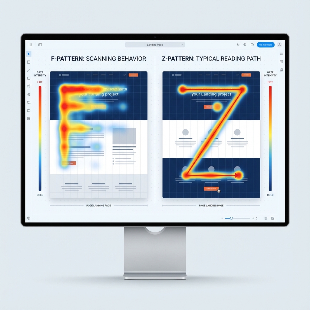
F-Pattern and Z-Pattern Layouts
Eye-tracking studies have revealed common patterns in how people scan web content:
F-Pattern: For text-heavy pages, visitors tend to scan horizontally across the top, then move down and scan a shorter horizontal line, then scan vertically down the left side. This creates an "F" shape. Z-Pattern: For simpler pages with less text, visitors scan from top-left to top-right, diagonally to bottom-left, then across to bottom-right. This creates a "Z" shape.Understanding these patterns helps you position your most important elements along the natural scan path.
Color Psychology and Contrast
- Colors carry psychological associations that influence how visitors perceive your landing page:
- Blue: Trust, professionalism, security
- Green: Growth, health, nature, money
- Orange: Energy, enthusiasm, attention
- Red: Urgency, excitement, passion
- Purple: Luxury, creativity, wisdom
- Black: Sophistication, elegance, authority
Beyond psychological associations, color contrast is crucial for accessibility and usability. Your CTA should contrast significantly with surrounding elements to draw attention.
Mobile-First Responsive Design
- With mobile traffic now exceeding desktop for many industries, landing pages must be designed mobile-first. This means:
- Touch-friendly buttons with adequate size and spacing
- Thumb-zone optimization for key interactions
- Readable font sizes without zooming
- Fast load times on cellular connections
- Simplified forms for mobile input
- Vertical layouts that work on narrow screens
Loading Speed: The Invisible Conversion Factor
Page loading speed has a direct, measurable impact on conversion rates. Research by Google found that as page load time increases from 1 to 3 seconds, the probability of bounce increases by 32%. From 1 to 5 seconds, that probability increases by 90%.
- Optimization techniques for fast-loading landing pages:
- Compress and optimize images
- Minimize HTTP requests
- Use browser caching
- Minimize JavaScript and CSS
- Implement lazy loading for below-the-fold content
- Use a content delivery network (CDN)
- Choose fast, reliable hosting
White Space: The Power of Nothing
- White space (or negative space) is the empty space between and around elements on your page. Despite containing "nothing," white space is a powerful design tool that:
- Improves comprehension and readability
- Creates visual breathing room
- Directs attention to key elements
- Conveys sophistication and quality
- Reduces cognitive load
Many marketers instinctively want to fill every pixel with content, but restraint often leads to better-converting pages.
Conversion Rate Optimization: The Science of Improvement
Creating a landing page is just the beginning. High-performing marketers treat landing pages as living experiments, constantly testing and optimizing to improve conversion rates over time. This discipline—Conversion Rate Optimization (CRO)—combines data analysis, psychology, and experimentation to systematically improve performance.
Understanding Conversion Rate
Conversion rate is calculated simply: the number of conversions divided by the number of visitors, expressed as a percentage. If 500 people visit your landing page and 50 complete your form, your conversion rate is 10%.
Average conversion rates vary significantly by industry, offer type, and traffic source. While benchmarks suggest typical landing page conversion rates range from 2% to 5%, top-performing pages can achieve rates of 20% or higher for well-targeted campaigns.
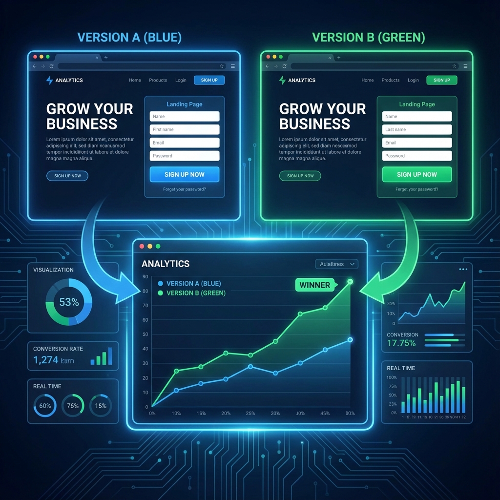
A/B Testing: The Foundation of Optimization
A/B testing (also called split testing) is the practice of comparing two versions of a page to determine which performs better. Visitors are randomly shown either Version A (the control) or Version B (the variant), and conversion rates are measured for each group.
- Elements commonly A/B tested on landing pages:
- Headlines and subheadlines
- CTA button text, color, and placement
- Form length and field order
- Hero images and videos
- Value proposition messaging
- Social proof presentation
- Page layout and structure
- Pricing presentation
- Best practices for A/B testing:
- Test one element at a time: Changing multiple elements simultaneously makes it impossible to know which change caused the difference.
- Ensure statistical significance: Run tests long enough to gather sufficient data. Declaring winners too early leads to false conclusions.
- Document and learn: Keep records of all tests, including failures. Failed tests often provide valuable insights.
- Test continuously: Optimization is never "done." Even high-performing pages can be improved.
Multivariate Testing
For more advanced optimization, multivariate testing examines multiple variables simultaneously, testing different combinations of elements. While more complex than A/B testing, multivariate testing can reveal interactions between elements that individual tests would miss.
Analytics and Conversion Tracking
Before you can optimize, you need to measure. Essential metrics for landing page analysis include:
Tools like Google Analytics, Hotjar, and specialized landing page platforms provide these insights, enabling data-driven optimization decisions.
The Role of Qualitative Research
While quantitative data tells you what is happening, qualitative research reveals why. Methods for gaining qualitative insight include:
Personalization and Dynamic Content
- Moving beyond static optimization, advanced landing pages use personalization to display different content to different visitors based on:
- Geographic location
- Referral source
- Past behavior and interactions
- Demographics
- Industry or company size
Personalized landing pages can dramatically outperform generic alternatives by presenting messages that feel specifically relevant to each visitor.
Common Landing Page Mistakes to Avoid
Even experienced marketers make landing page mistakes that sabotage conversion rates. By understanding these common pitfalls, you can avoid them from the start and create more effective pages.
Misaligned Message Match
When the messaging on your landing page doesn't align with the ad or link that brought visitors there, confusion and distrust result. If your ad promises "Free Shipping on All Orders" but your landing page makes no mention of this offer, visitors will feel misled and leave.
Always ensure tight message match between your traffic sources and landing pages. The promise made in your ad should be immediately reinforced when visitors arrive.
Too Many Choices and Distractions
Including multiple offers, numerous navigation links, or excessive content creates cognitive overload. Visitors shouldn't have to decide which action to take—there should be one clear, obvious path forward.
Audit your landing pages for anything that doesn't directly support conversion. Navigation menus, sidebar links, and competing offers often hurt rather than help.
Weak or Vague Headlines
Generic headlines like "Welcome to Our Website" or "We Offer Great Products" fail to capture attention or communicate value. Your headline must be specific, benefit-focused, and compelling enough to earn the visitor's continued attention.
Buried or Invisible CTAs
If visitors can't easily find your CTA, they can't convert. CTAs should stand out visually and appear at logical decision points throughout the page. For longer pages, multiple CTAs at different scroll positions ensure every visitor encounters one when they're ready to act.
Asking for Too Much, Too Soon
Long forms, requests for sensitive information, or demanding major commitments on first interaction creates friction. Match your ask to the value you're providing and the visitor's stage in the relationship.
Ignoring Mobile Users
Mobile-unfriendly landing pages frustrate a significant portion of potential converters. Touch targets that are too small, unreadable text, and slow loading on cellular connections all damage mobile conversion rates.
Slow Loading Speed
Every additional second of load time increases abandonment. If your page takes more than 3 seconds to load, you're losing potential conversions. Prioritize speed optimization.
Lack of Social Proof
Claims made by companies about their own products are naturally viewed with skepticism. Social proof—evidence that others have purchased and been satisfied—provides the third-party validation that builds trust.
Ignoring Testing and Data
Many marketers create landing pages based on intuition and then never revisit them. Without ongoing testing and optimization based on real data, you're leaving conversions on the table.
Real-World Examples and Case Studies
Understanding landing page theory is valuable, but seeing principles applied in practice brings them to life. Let's examine examples that demonstrate effective techniques in action.
E-commerce: The Power of Urgency
A leading online retailer tested adding a countdown timer showing when same-day shipping would expire. This simple addition created urgency without changing any other element. The result: a 9% increase in conversion rate and a 27% increase in revenue per visitor.
Key takeaway: Legitimate urgency drives action. When you can provide a real reason to act now, make it visible and prominent.SaaS: Simplifying the Value Proposition
A B2B software company found that their original landing page, filled with detailed feature lists and technical specifications, was converting at only 2.3%. They redesigned the page to lead with a single, clear value proposition: "Save 10 hours per week on reporting." Feature details were moved below the fold. Conversion rate jumped to 6.1%—a 165% improvement.
Key takeaway: Lead with benefits, not features. Visitors want to know what's in it for them, not how your product works.Lead Generation: Form Optimization
A marketing agency tested a landing page with an 8-field form against a version with just 3 fields (name, email, company). The short form converted at 25% higher rates. However, the leads from the longer form were more qualified and converted to customers at 40% higher rates.
Key takeaway: Form length is about trade-offs. More fields mean fewer but more qualified leads. Choose based on your qualification needs and follow-up capabilities.Service Business: Video Impact
A professional services firm added a 90-second explainer video to their landing page, keeping all other elements identical. Visitors who watched the video converted at 4x the rate of those who didn't. Overall page conversion increased by 56%.
Key takeaway: Video can dramatically increase engagement and conversion—when the content is compelling and well-produced.Non-Profit: Emotional Storytelling
A charity organization tested their typical donation page—featuring statistics about the problem they addressed—against a version featuring a single story about one individual impacted by their work. The story-focused version increased donations by 134%.
Key takeaway: Stories connect emotionally in ways that statistics cannot. Personal narratives drive action.Tools and Resources for Landing Page Success
Creating high-converting landing pages no longer requires coding skills or expensive designers. Modern tools have democratized landing page creation, making it accessible to marketers of all technical abilities.
Landing Page Builders
LandingDad: A modern, AI-powered landing page builder that combines ease of use with powerful features. With drag-and-drop editing, pre-built templates designed for conversion, A/B testing capabilities, and seamless integrations, LandingDad enables businesses of all sizes to create professional landing pages in minutes. The platform's focus on conversion optimization and user-friendly interface makes it an ideal choice for marketers who want results without the complexity.Other notable landing page platforms include various options in the market, each with their own strengths and use cases. When choosing a platform, consider factors like ease of use, template quality, A/B testing capabilities, integration options, and pricing structure.
Analytics and Testing Tools
Design and Asset Creation
Copywriting Assistance
The Future of Landing Pages
As technology evolves, so too will landing pages. Understanding emerging trends helps you prepare for what's ahead and potentially gain early-adopter advantages.
AI-Powered Personalization
Artificial intelligence is enabling personalization at scale. AI can analyze visitor behavior in real-time and dynamically adjust landing page content, recommendations, and offers to match individual preferences and needs.
Voice Search Optimization
As voice search grows, landing pages will need to adapt. This includes optimizing for conversational queries, providing quick, direct answers, and considering voice-based conversions.
Increased Interactivity
Static pages are giving way to interactive experiences. Calculators, quizzes, product configurators, and other interactive elements engage visitors more deeply and provide personalized value that static content cannot match.
Privacy-First Design
With increasing privacy regulations and browser restrictions on tracking, landing pages will need to rely more on first-party data and transparent value exchanges. Building trust through clear privacy practices becomes a competitive advantage.
Micro-Conversions and Progressive Commitment
Rather than asking for big commitments immediately, landing pages are increasingly guiding visitors through smaller steps—watching a video, exploring a calculator, engaging with a chatbot—before requesting contact information or purchase.
Conclusion: Your Path to Landing Page Success
Landing pages are more than just web pages—they're precision-engineered conversion tools that sit at the heart of modern digital marketing. By understanding what landing pages are, how they differ from other web pages, the various types available, and the essential elements that drive conversion, you're now equipped to create landing pages that deliver measurable results.
Remember that landing page creation is both an art and a science. The art lies in crafting compelling messages, designing beautiful experiences, and connecting emotionally with your audience. The science lies in testing, measuring, and systematically optimizing based on data.
Start with the fundamentals covered in this guide: a clear value proposition, a compelling headline, focused design, persuasive social proof, and a prominent call to action. Then, commit to ongoing testing and improvement. The best landing pages are never truly "finished"—they evolve based on what you learn about your audience.
Whether you're launching your first landing page or your hundredth, the principles in this guide will help you create pages that convert more visitors into leads and customers. And with modern tools like LandingDad, you can bring professional landing pages to life quickly and easily, without technical expertise.
The journey to landing page mastery begins with a single page. Take what you've learned here, apply it to your next campaign, and start measuring the results. Your high-converting landing page awaits.
Ready to create your first high-converting landing page? Try LandingDad free and see how easy it can be to build professional landing pages that drive results.